Saturday, 30 April 2016

Blackout Film Review

Final film review


Evaluation

I tried to copy the format of the review in Empire magazine I analysed ("The Man with the Golden Arm"). The spread is conventional of a magazine, with a clear house scheme (black, white and red), same typography throughout, border, page numbers, reference to the section of the magazine, split into clear columns, drop cap indicating the start of the article and a sign off by the author. I think all of these small touches have created a realistic spread. I also conformed specifically to the conventions of a film review- I used the 5 star rating system that most magazines use, added a box featuring all the key information (modeled off the information in Sci-Fi Now), a feature detailing recommended films for a direct comparison and numerous stills from the film. The main one dominates around half of the first page, and each has an inset caption for an audience not familiar with the plot. These all link the review directly to my film

The part I found the hardest was actually writing up the review. Because I had written, filmed and edited the film, I recognised the weakest parts of it, however to promote it in a magazine I had to make it sound as appealing as possible. I discussed the background of the film and the directors to give it context and then reviewed the cast, considering feedback I had been given by the target audience to make it realistic. I tried to include jargon to make the article sound as sophisticated as possible. If this were a real film review, it would be best received in a magazine dedicated completely to cinema, such as Empire because film noir is not a mainstream genre, and readers would understand the terminology. Audiences of a more mainstream lifestyle magazine may not be familiar with the codes and conventions I refer to in the article. Film magazine readers are also likelier to understand the intertextual references I make to other films, which they hopefully will have enjoyed. They are both modern films as opposed to classic film noirs, which will hopefully attract my target audience of young adults- they may not be familiar with the classic films of the 1940's and 1950's.

I created a mock-up of what my film review would look like if it were actually published in Empire magazine.


Film review research


Friday, 29 April 2016

Blackout Film Poster


Evaluation

I am overall very pleased with this poster and I think that my research definitely helped me make it look realistic. I included all of the relevant and conventional information; the title, credited the main cast, crew and production team, the film studio, tagline, release date and a hashtag to link the film to social media in order to generate hype. This is especially significant as my audience is young adults who are typically more into social networking.

I tried to link the poster to the film as much as possible, using a still from early on in the film (revealing few spoilers, however there is some subtle foreshadowing) and using the same typography (Futura font in retro style) from the opening sequence of the film. There are also lots of references to the genre of film noir in an attempt to attract a secondary audience of film noir fans (who are generally older). These include the cigarette and smoke, blood splatter behind Kevin and Violet's red lips. I divided the poster into two and made the half showing Violet black and white, another link to classic noir iconography. The filter also enhanced the shadows behind her and made her look more sinister, matching the idea of her being a femme fatale. The side showing Kevin matches the colour palette of the film, with low saturation and lots of dark, muted colours giving a depressing effect.

The main issue I have with my poster is the photograph itself. I had a limited number photos that were high enough quality to use and although this was the best one, it shows Violet smiling as opposed to the classic femme fatale who is normally pouting or looking smug in a position of power. It initially made the poster look more like a romantic comedy than a film noir, so I tried to edit the photo as much as possible to try and hide this.I tried photoshopping another pair of lips on however they looked noticeably false. I tried making the photo darker and increasing the contrast between black and white so the shadows made her look more villainous, which was slightly better. I made her eye makeup thicker and darker, giving the illusion that her eyes were more narrowed with suspicion, which was more effective.

Overall I think this poster would be successful and looks realistic. In real life, this would be placed strategically around places where a significant proportion of the target audience would see it- for example in cities, in underground stations, bus stops or billboards near where they would spend their free time, such as a shopping centre or cinema.


Initial ideas for my own film poster


Thursday, 28 April 2016

Analysis of existing film posters


Initial research for film poster

What is the aim of a film poster?

Although many film posters have artistic value (many have become iconic, for example Jaws, A Clockwork Orange, The Godfather and Breakfast at Tiffany's), the main purpose is commercial. They are supposed to promote and generate hype for an upcoming film (especially from the target audience).


Some particular conventions are:

  • Film title
  • Release date
  • Tagline
  • Main cast
  • Main production team and director
  • BBFC rating
  • Production companies 
  • Links to a website or social network
The amount of information included will depend on whether it is a teaser poster or a main poster.

Importance of graphics

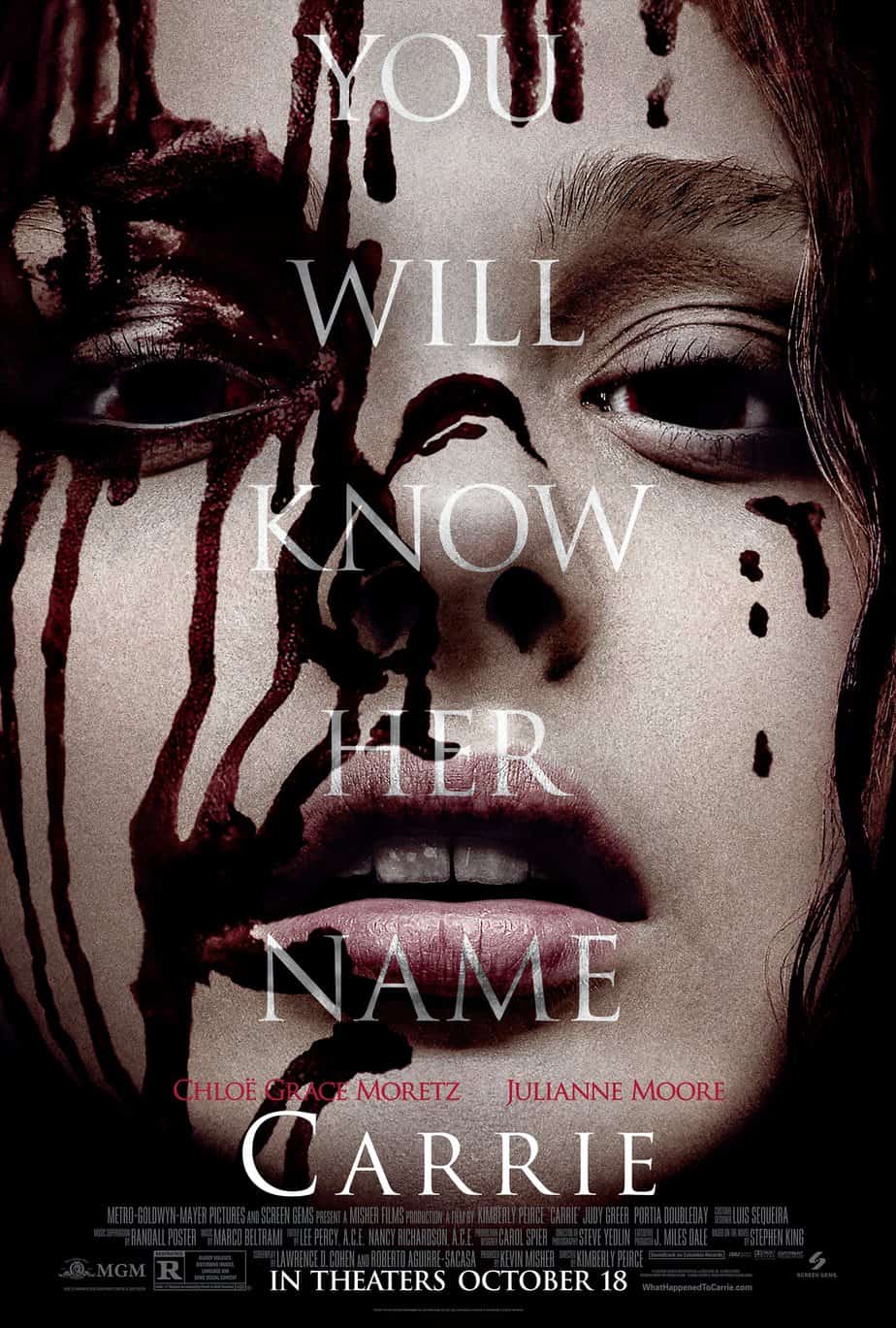
Graphics range from the typography of the poster to the kinds of images and special effects used on the poster. It is important to use graphics which make the poster stand out (as they are often seen from a distance)- so bright colours and big, bold fonts. It is also important to use iconography associated with the genre- for example a horror film poster would typically be dark, with lots of shadows, and use images such as dripping red blood, a full moon, supernatural creatures or sinister silhouettes. Linking the poster to a genre is useful in attracting the right audience. The audience will be interested in something which they are familiar with and they will know they are buying into something they will enjoy.

This is clearly a horror film poster
Where would you see a film poster?

Film posters are not just pinned to a wall- they can be found in a variety of locations and are generally strategically placed in order to attract the right audience. For example, because women stereotypically enjoy shopping, a billboard outside of a retail complex may promote a romantic comedy, which are normally targeted at women. 

Types of film posters you may see include:
  • Billboards
  • On the sides of buses
  • Bustops
  • Underground stations
  • Public transport
  • 3D cutouts in cinemas
  • In magazines
  • Online (pop-ups, social media)
Different film posters used to promote Spectre

Tuesday, 26 April 2016

Target audience feeback

These vox pops show the initial reactions to our film noir from a group of 16-17 year olds, who fall under our target audience. 


Overall, the response to our film was generally positive, however there were some criticisms as the above video shows.

Importantly, everyone we asked said that they both understood and enjoyed our film, despite many of them not being familiar with film noir. Therefore I would argue that our film was successful and am proud of what we achieved.

Thursday, 21 April 2016

Ending

Our film ends with Violet turning Kevin in to the police. She publishes the story exclusively and her career is a huge success from then on. She releases a book on the topic which instantly becomes an international bestseller, while he is found guilty and given a life sentence. This fits in with the conventions of film noir- he is the fall guy, whose life is ruined by the femme fatale's manipulation. She escapes unscathed.

We weren't sure how to show her success on camera- with the budget and resources we have as students it would have been hard film scenes like this (with lots of extras and expensive props). We had to be creative, and finally came up with the idea of a montage using clippings from the internet and social media to tell the story. This would then also bring our film noir completely up to date and make it relevant for a younger audience who are stereotypically 'obsessed' with social media. 

We began by making fake news articles using online generators such as newspaper.jaguarpaw.co.uk and fodey.com. These were the results we came up with.


We also generated a fake series of tweets from Violet, documenting her rise to success using letmetweetthatforyou.com.


We saved all of these as JPEG files and intent to order, add transitions to and put music to them on Final Cut Pro X.

Tuesday, 12 April 2016

Behind the Scenes

Some behind the scenes footage of us shooting the film.


Props, Costume and Makeup

Props

The props we needed (in order of appearance) were:
  • Newspaper
    • Headlining the murder Kevin is responsible for. This would obviously have to be custom made, however we did not have the resources to make a realistic broadsheet newspaper and did not want a prop which was obviously false. Instead we created an electronic newspaper using an online generator, for Kevin to read on a newspaper. This works just as effectively and reflects the digital age. 
  • Murder weapon
    • We chose to use a knife as the murder weapon. We wanted to use a knife or a gun because they were the most effective onscreen, and of the two a knife would be easiest to access. We used a kitchen knife (we took care to wrap it up to avoid as many safety issues as possible).
  • Psychiatrist's certificate
    • We wanted to keep this scene silent, however we had to make it clear to the audience what was going on and who Kevin was talking to. The simplest way to do this was to include in the scene a certificate of psychiatry within the office. We created this by photoshopping an online template and then framing it on the shelf.
  • Cigarettes
    • We did consider making our own fake cigarettes using herbs and rolling papers (as shown in the YouTube tutorial here), however this was not practical in terms of time and money, and the actress was concerned about the taste. Instead our lead actress consented to smoking in the film. 
  • Bloody sheets
    • To achieve this, we splattered old bed sheets with fake blood we made at home, using ingredients such as red food dye, syrup and ketchup.
  • Medicine
    • We simply needed to show that Kevin was on prescription drugs, and were able to use normal, over the counter medicines at home to give this illusion. We simply filmed these scenes in front of our own bathroom cabinets.
  • Psychiatric report
    • We created our own medical report on Microsoft Word using using images we had seen on google as a rough guide- for example typing up a typical medical history, and then attaching a handwritten analysis by a psychiatrist, purposely drawing attention to words that were relevant to the plot to enhance the audience's understanding of the narrative.

Costume


Femme Fatale: Makeup and Hair

Makeup was very important when styling the femme fatale, as we noticed from watching early film noirs that there was a very obvious style; dark eyes, pale skin and red lips. Whilst we wanted to follow this convention, we also didn't want the makeup to look too classic, but a more modern look for the audience to relate to. We searched the internet for inspiration, and decided to use winged eyeliner, which is currently popular and makes the eyes look darker and keep the skin as natural as possible. The lipstick we chose is a retro red and matte which is more traditional. This was especially important as the lipstick is important iconography. Because red connotes danger and blood, the femme fatale only wears it when she shows her true colours and turns Kevin into the police- at the beginning she looks a bit more natural and fresh faced, so we think she is innocent.

Inspiration

Some of the makeup we used

Again with the hair, we wanted to do a modern look but take inspiration from old film noirs. Classic noirs were filmed in the 1940's-1950's and hair was often worn curled in victory rolls. We decided that while we would also have curly hair, we would style it in a more natural way, taking inspiration from the contemporary beach waves trend (as the victory rolls would be more dated).

Victory Rolls, Beachy Waves and Violet's hair